Design Challenge
Using the overarching university brand platform–Forever OHIO to leverage specific elements to create a visually consistent and resounding platform to gather the work of diversity and inclusion happening on the Athens campus at OHIO. It is vital that this work be able to encompass all of OHIO’s core values around diversity and to aspirationally develop an ideal for members of our community to strive toward.
“In this moment, it’s not just about who we are, but who we need to become”
Design Elements
Colors, text treatments, and textures are a subset of the FOREVER OHIO brand. This lockup uses Termina and P22 Mackinack. In using the campaign icon, it should never be used in place of the official OHIO signature. Its intended use is meant to imply affiliation with this effort. Think: event posters
Copy Elements
The “platform”, while it may read like a commercial or voice-over script–is intended to give voice to the visual elements. Its function is to build the initial “personality”, to set a tone, and to do the work of organizing the creative team around the concept. For this project, it was crucial to have a foundational vocabulary in order to avoid watering down the message.
Campaign Platform
We follow in the footsteps of OHIO’s firsts:
Templeton, Boyd, Blackburn, Murayama, Childs
Their visibility opened doors for us.
Learning from our storied past,
We know first-hand the transformative nature of our community, we challenge ourselves to go further.
We believe the moments we don’t see are the ones that can matter the most, and those are the ones that should be a part of our everyday conversations.
We see it in offices across campus.
We see it in peer mentoring, in meetings, and in classrooms.
It’s seen In research, in study sessions, and in our residence halls.
We shine a light so that this work can be seen.
We provide a platform to the voices of the overlooked,
We give space to engage, to be challenged, and to grow.
Because, in this moment it’s not just about what we need to do, but who we need to become.
The harder we look, the more becomes visible
The more we make visible, the more we will see.
Annual Report
The 2020 Annual Report was the centralized platform to articulate the VISIBLE OHIO campaign. This report took ample opportunity to feature student, faculty, and staff stories and highlighted the work these individuals are doing to contribute to a more diverse OHIO.
Poster & Social PSA Series
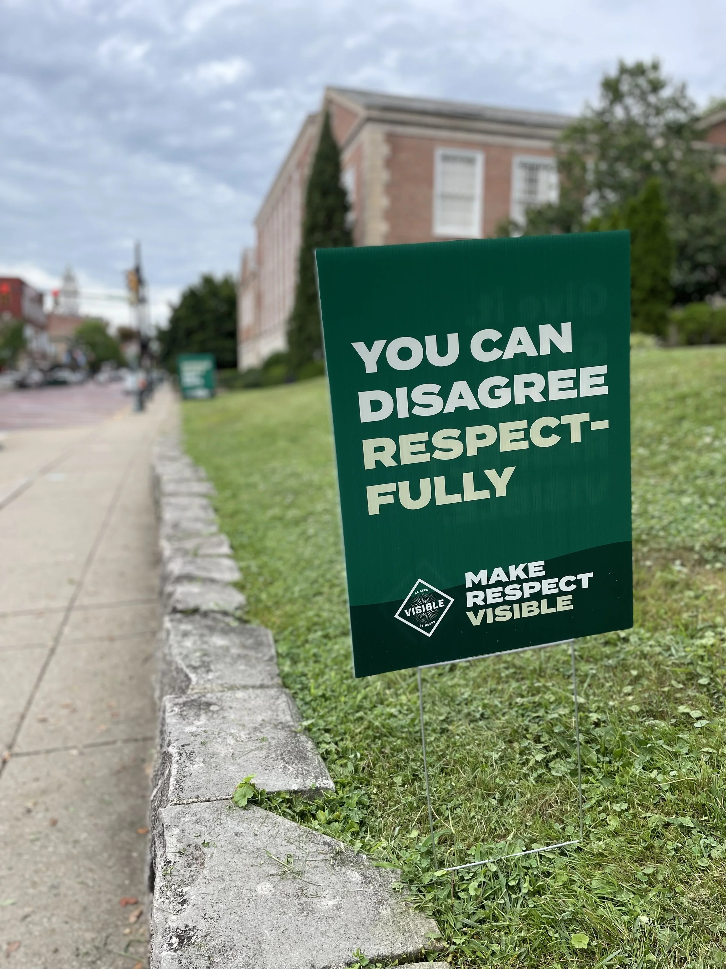
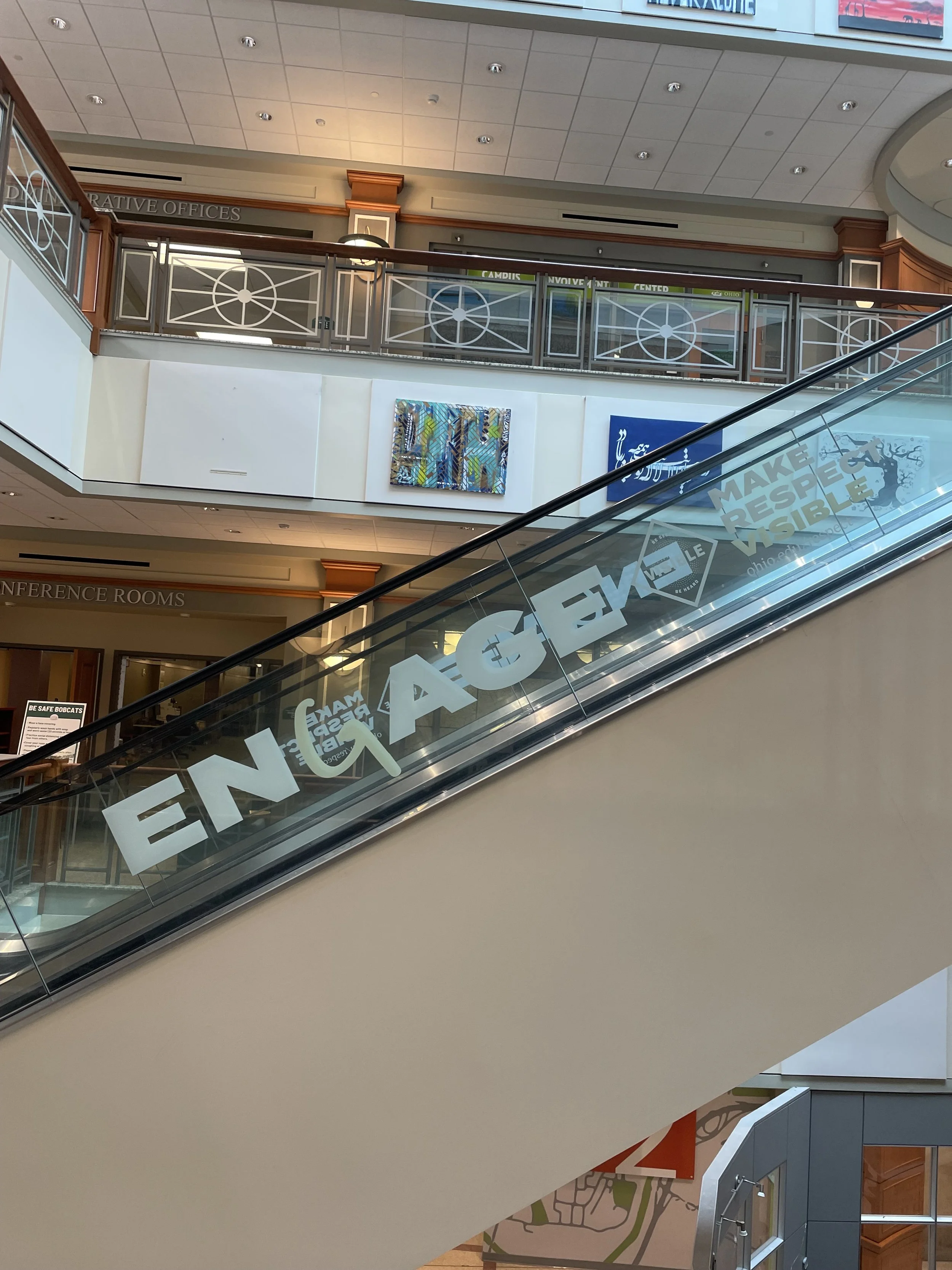
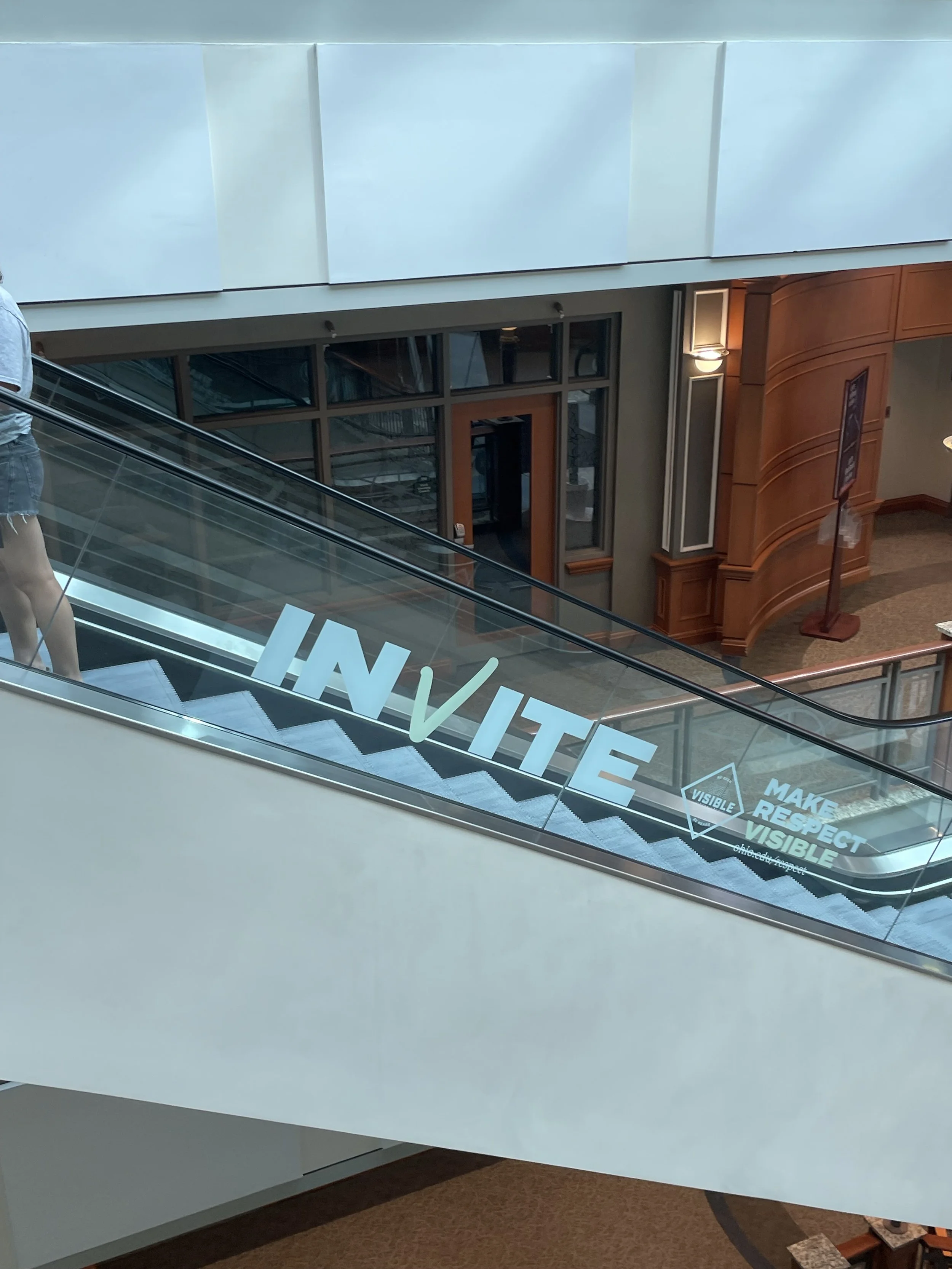
Environmental
Apparel
In the world of student affairs, if it doesn’t work on a t-shirt, it’s not a compelling enough message, right?
Credits
Art Direction Sheldon Andrus
Visible Icon Design Aaron Harden
Copyrighting Sheldon Andus + Dr. Duane Bruce, Ed.D.


